Regent's Crescent, London
Featured in RIBAJ’s Products in Practice, May/June 2021, by Pamela Buxton
If shoes say it all about a person, floors certainly do that in buildings. And in apartments that sell for up to £18m, quality must be unsurpassed.
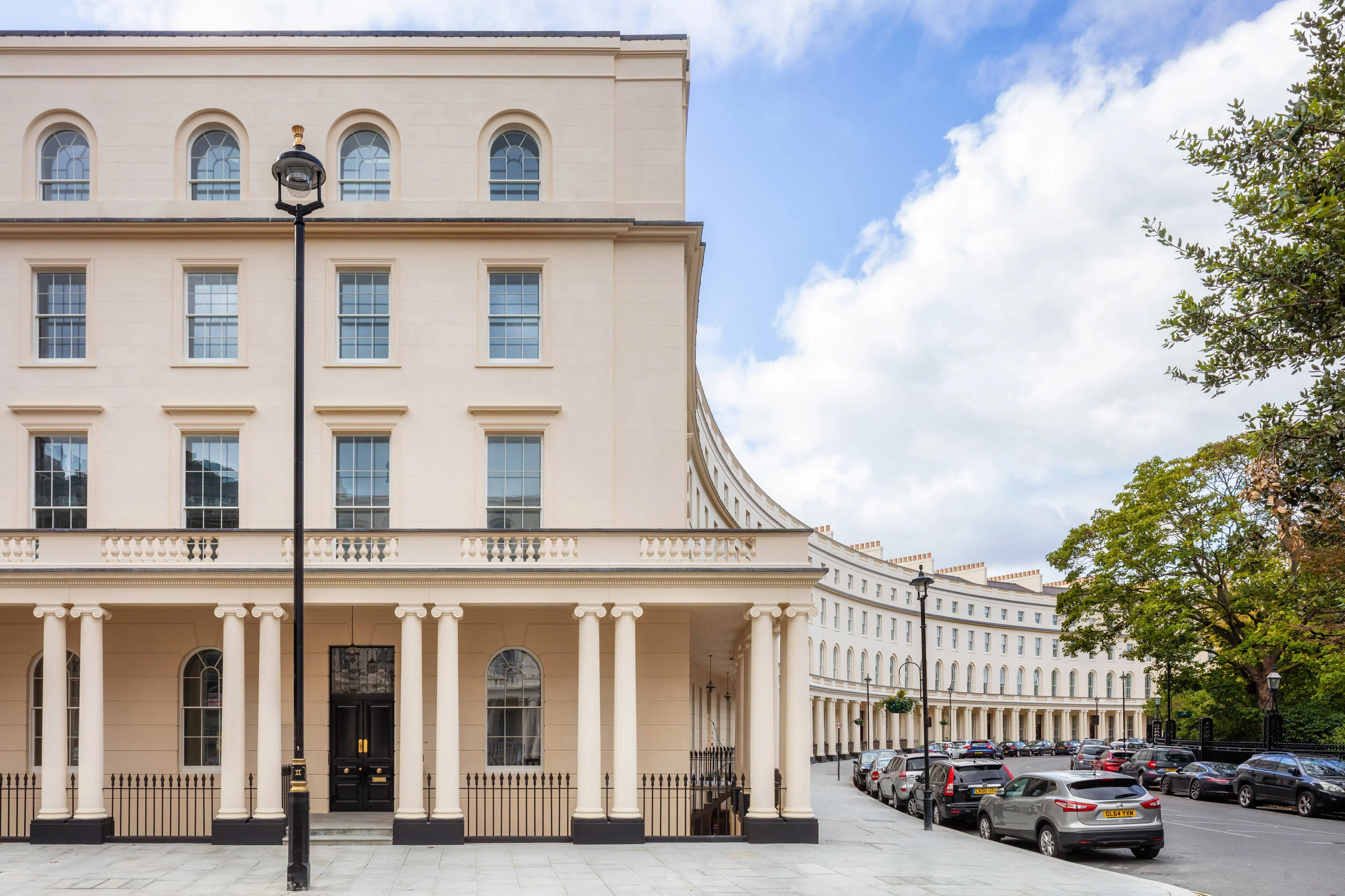
Regent’s Crescent is a quite remarkable development in many ways. Both its pedigree and location are exceptional - a sweeping John Nash-designed terrace situated just to the south of London’s Regent’s Park. Yet even more re-markably, despite being grade I listed, this is almost entirely a new build. And thanks to PDP London’s faithful facade recreation, few of those strolling by on their way to the park would guess it dated from 2020, rather than 1820.
This is super-prime residential – apartments start from £2.9 million and rise to nearer £18.6 million, with garden villas from £5.3 million. And with those price tags, comes a meticulous attention to detail – from the clay chimney pots atop chimneys that are purely decorative but authentic to the original design, to flooring specs scrutinised to the millimetre to get just the right size of knot in the oak and the exact degree of veining in the beautiful stone tiling.
PDP London completed the £180 million project for investment consortium PCW, with interiors designed by Millier. The 16,800m² development has 67 apartments in the west crescent plus a terrace of nine mews houses, with a communal garden in between. The new build also ties into two retained 1960s residential wings at the rear.
To add to the site complexity – as well as those 1960s buildings, PDP had to contend with a 3.5m level change and the vibrations of four underground lines passing beneath, which re-quired the whole structure to sit on dampening bearings.
PDP was originally asked to look at a scheme that retained the crescent building, but quickly realised that a rebuild was the only viable way to create the layouts and cores required for its return to residential use, along with all the amenities and servicing that super-prime requires. Nor would facade-retention deliver an authentic Nash appearance. This was because the crescent had already been rebuilt with a new facade as offices by Fitzroy Robinson & Partners in the 1960s, following extensive war-time bomb damage. So there was precious little of the original fabric to go on - although some Nash plasterwork and rubble was fished out of an ice house that was discovered in the rear garden, and must have been filled in during earli-er rebuilding.
View of the crescent from the top of Portland Place.
Instead, PDP proposed re-building it ‘properly and in a scholarly fashion’ according to associate Iain McLellan. This involved extensive research into the Nash original, collaboration with English Heritage, and working closely with engineer AKT to recreate the load-bearing brick facade with appropriate period details and a slightly higher mansard than the original. The new facade, which varies in thickness from 215mm to 450mm, was then dressed in lime stucco and a breathable paint, and topped with a steel-framed, slate-topped roof. The colonnade of Ionic entrance columns that provide a rhythm to the crescent elevation was recreated in cast concrete, alongside grand front doors with Regency-style fanlights.
Once the crescent had been demolished (aside from an original portion flanking Portland Place), replicating the exact original setting out of the crescent – and its Ionic-columned entrances in particular – was a challenge. The architect achieved this setting out with a radial grid from an origin point in the crescent gardens opposite. PDP had far more freedom at the rear, which is more contemporary in character while seeking to complement the front elevation. Here, the design respects the radial plan and incorporates limestone, brick, photo-voltaic panels and bespoke leaf-design balustrades and small areas of terned steel. The new crescent incorporates a variety of apartment types ranging from one to five bedrooms across five residential floors. Generally speaking, there are 10 apartments per core, with no more than two entrances per floor. Apartments include one-bedroom lower ground floor units – some of these have been bought by owners of larger units as staff accommodation. Ground/first floor apartments make the most of ceiling heights of up to 4.25m, and include some duplex and split-level triplex. These ‘grand’ apartments are generally designed with the most heritage details while the other apartments have a more modern interpretation of Regency details. The latter includes lateral units running the depth of the building on the second floor, and duplex penthouses on the upper two floors. Six units have their own entrances on the crescent.
The new garden mews houses have a light-weight CLT structure and a more contemporary aesthetic. They are supported by a Vierendeel truss, which spans the restored ice-house beneath the mews. Shared amenities including swimming pool, spa, cinema, and business suites are in the main building’s basement with a car stacker and plant for the pool in a further basement level.
A double staircase sweeps down from the main entrance on the crescent to the reception. Interiors are by Millier London, which combined pale limestone flooring from Tasca Stones with contrasting dark metal detailing.
The common areas and show apartments have a calm, understated quality rather than showy ostentation. Millier London, as sub-consultant to PDP for the interiors, aimed to create classic and beautiful homes with gravitas.
‘We were inspired by Regency style and the building itself,’ says Millier associate architect Valeria Doro. ‘But we didn’t want to create just a replica of the Regency look. Instead, we wanted to bring in a balanced contemporary and modern luxury living with the use of certain materials and finishes used throughout the scheme, but applied differently. Focus on charm, grandeur, elegance and architectural proportions have been constantly leading us throughout the design process.’
Arrival is given a sense of theatre by an elegant double staircase, which makes use of the level change to lead down from the crescent to the double height reception area, and the garden beyond. This is the hero, says Doro – there is no need for a conventional statement chandelier.
The staircase fans out at the bottom, its sweep accentuated by the rippling design of the steel balustrade. The materials and detailing exemplify one of Millier’s key approaches – the use of pale stone flooring with contrasting accents of antiqued metal finishes such as inlay, balustrades and ironmongery. Honed finishes add a sense of patina.
Finishes needed to be robust and of the highest visual quality. Italian, Greek and Turkish marbles were chosen to recall neo-classical influences. For the main entrance, other circulation areas and some lobbies, Millier wanted a light stone with a consistent, ‘blended’ appearance, and specified Alpine White limestone by Tasca Stones, after travelling to Turkey to select the slabs with the required characteristics. This is used in 600mm by 600mm tiles with flush limestone joints and minimal grout detail.
‘We didn’t want too much vein for the lobby, as that can be hard to control and can make it look too busy,’ explains Doro.
Another, far darker Tasca Stone tile with orange and white veins – Portoro Brecciato Marble – features in the lift cars. For the tranquil swimming pool and other amenity areas, Millier wanted flooring with a similar appearance to the Alpine White of the main entrance but needed an alternative to limestone, which doesn’t react well to chlorine. The solution was Domus’s Natural Limestone porcelain tiles, which are more practical for poolside use while maintaining a similar appearance. These are used with a bush-hammered finish on the floor, but honed for a softer effect on the walls. The 14mm thickness gives a strong edge to evoke a monolithic, floating floor over the water.
The small, plush screening room has a soft dark carpet from Westex (Vogue Galena) with a silken weave which, along with the dark blue acoustic panelling, helps create a moody atmosphere. The flooring for the gym needed to be suitable for high traffic, and for this Millier specified Bolon woven textured vinyl.
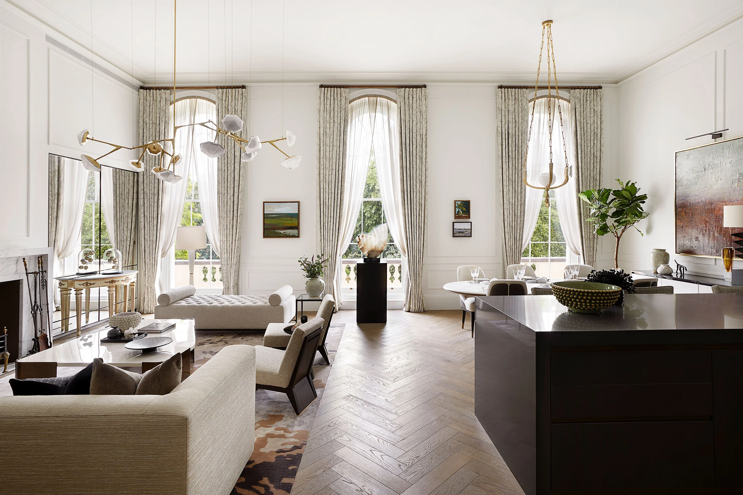
One of the grand crescent show apartments. Here, oak flooring by Ted Todd was used in a herringbone pattern.
In the crescent apartments, Millier decided against carpets – these are not deemed sufficiently high-end for luxury residential – and instead specified timber as a durable, comfortable, warm, luxurious and timeless material. The mid-tone Tolland Artisan Oak flooring by Ted Todd was chosen for both reception rooms and bedrooms. Great care was taken over the specification – the grading report specified 13 characters including the size of knots and tones, with the oak needing to be virtually knot-free. The chosen oak is 20mm engineered board including a 4mm solid oak layer on top, finished in burnished hardwax oil. This is used in various ways, including herringbone pattern in 120mm by 600mm boards in grand reception rooms and in simple 220mm by 2000mm planks in the bedroom and dressing room running parallel to the facade.
Four different stones by Campolonghi are used as flooring in the crescent apartments’ bathrooms, which were manufactured as pods in Italy. All are honed to give a patina effect. In the master ensuite, Greek Galaxy, a white marble with small veins, was chosen for its soft character, used in large format 1200mm by 800mm on walls and 600mm by 600mm on floors to give a continuous brown-toned veining effect.
In further bathrooms ensuite, the floor and wall tiles include Volakas Ventato, a pure white stone with some strong grey-purple veins, and Tundra Grey, a mid-tone silvery grey. The most striking flooring is New St Laurent, a dark stone with sparse white veins, which is used in some of the powder rooms of the larger apartment to give a moody ambience.
In the more contemporary mews bathrooms, porcelain tiles by CI Tile were specified.
The design is evidently doing its job – despite Covid, the newly-completed development is 60% sold. Meanwhile, this newest of grade I listed buildings already looks like it’s always been there, its familiar Nash exterior quietly concealing super-prime accommodation within.
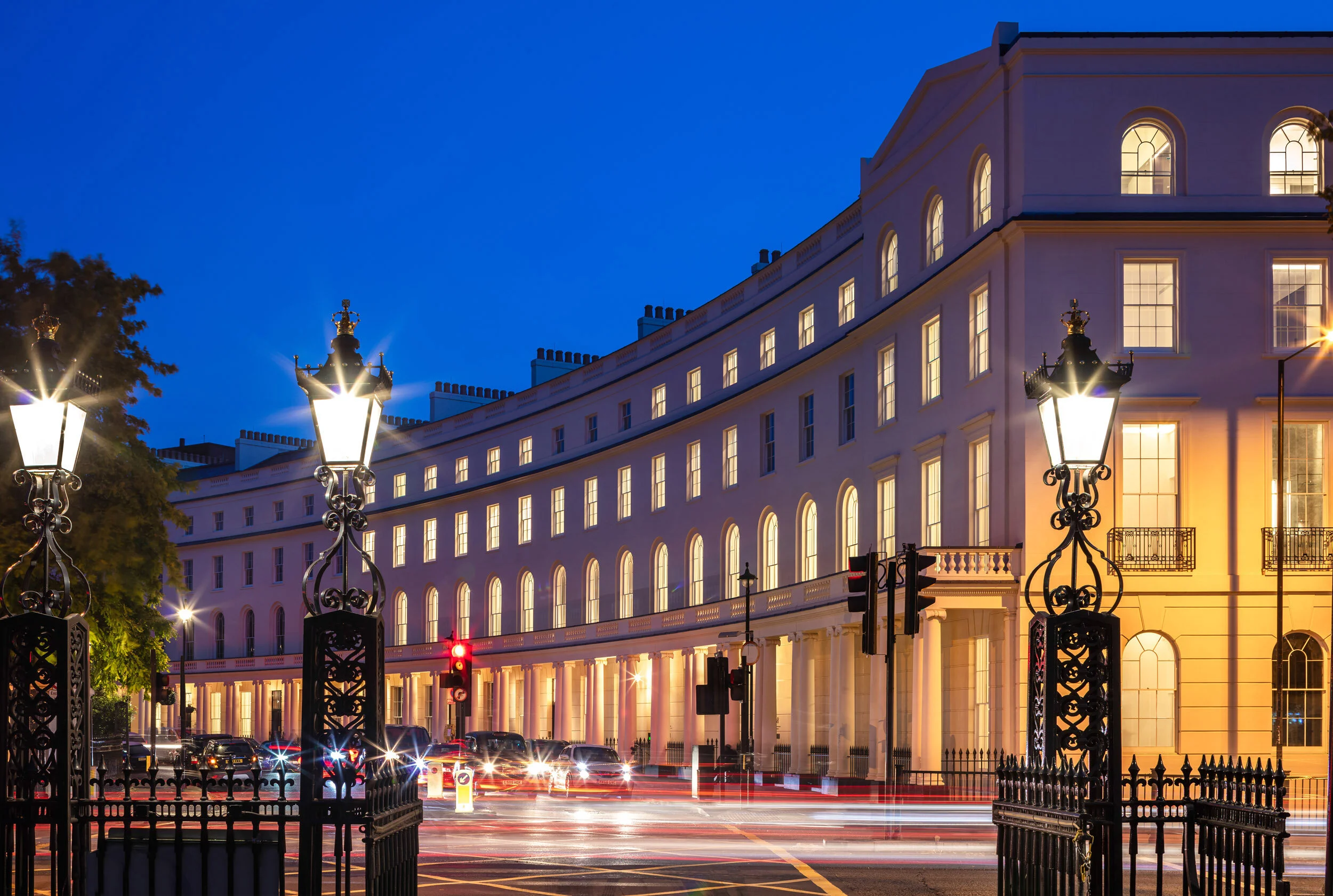
Regent’s Crescent seen from Park Square. The rebuild retains its grade I-listed status.
Client: PCW Planning and Development
Development manager: CIT
Architect: PDP London
Interior architect/designer: Millier London
Structural engineer: AKT
MEP Consulting Engineer: Hilson Moran
Contractor: Midgard
Bathroom pods: Stonebathwear
Selected flooring suppliers: Campolonghi (bathroom); Domus (amenity areas); Tasca Stones (common areas and lobbies); Ted Todd (oak apartment flooring)


