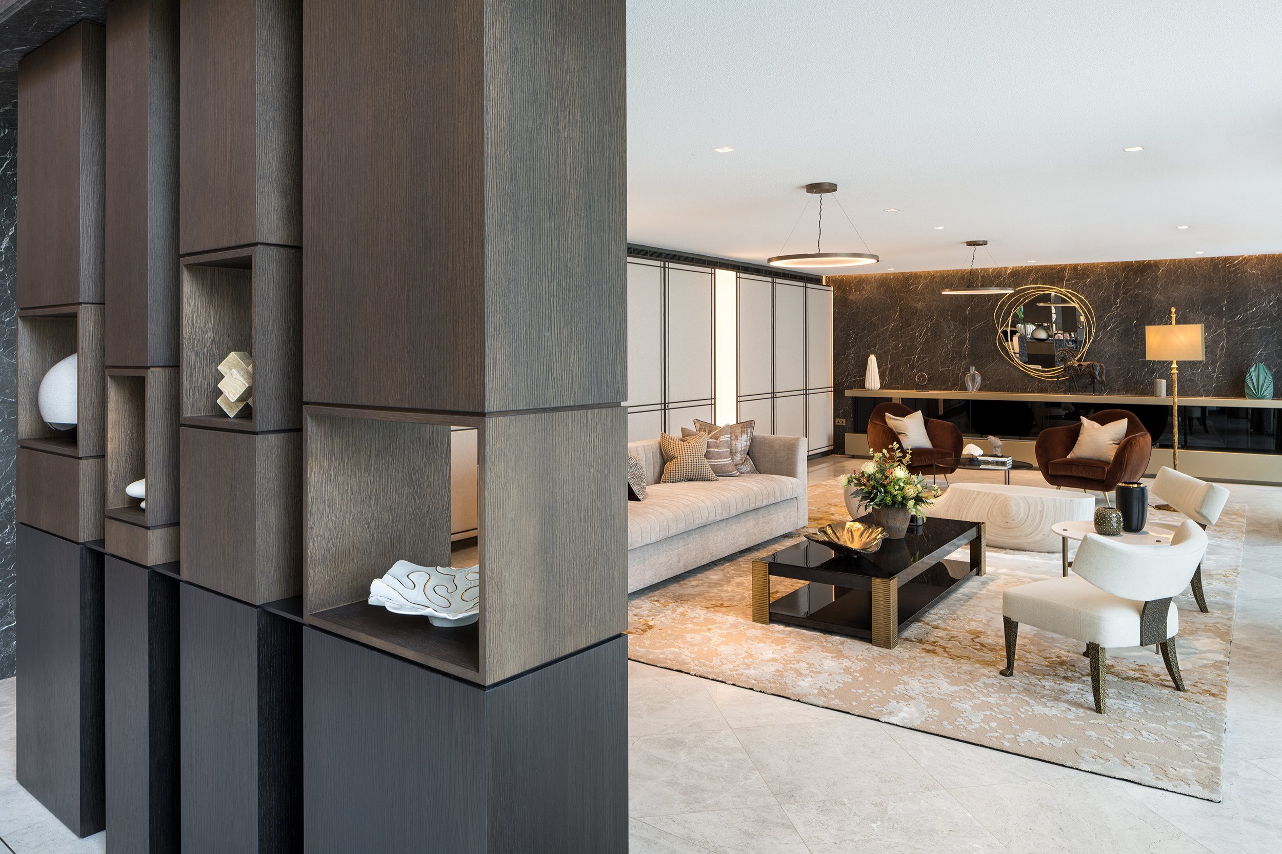
In pictures: making an entrance
When designing the entrance to Regent’s Crescent, we wanted to create a dramatic arrival to set a refined tone for residents and visitors. Transitioning from the colonnaded street outside - which exudes its 200 year Regency history - into a modern reception space, needed a special synergy between the heritage and the contemporary.
Regent’s Crescent comprises 68 new lateral, duplex and triplex apartments, nine garden villas and 92 apartments in two retrofitted blocks. Designed originally by John Nash, the Grade I listed Regency icon was newly rebuilt in 2020 as an authentic replacement to a 1960s facsimile, which came about following bomb damage sustained during WWII. Lost front doors were reinstated and brought back into active use along with many of the original features which were omitted in the post-war rebuild.
Central to the sweeping crescent townscape is the main entrance with its traditional double doors, inviting you through to continue the arrival experience. Drama is created with volume, height and craft; you arrive elevated, taking in views of the space and out to the gardens beyond. The triple height area is framed by a finely detailed imperial staircase presenting you with a choice of flights to descend to the main reception areas. With its delicate and elegant balustrade design that subtly changes during the descent, the feature staircase provides a sculptural experience which is complemented with the feature screen to the reception desk.
Designed in collaboration with Millier, the stair and reception flooring is Alpine White Limestone, the balustrade is a Champagne Stainless Steel appearance with a dark solid timber handrail, and the finishes are paired with dark marble and neutral paint colours.
It was important to set aside space in the building to create this memorable arrival experience and grandeur, reflecting Nash’s bold plans which still characterise this part of London today.


